I have started learning Python and Pandas recently and was looking for a good dataset to play with to get my feet wet. I chose the Chicago crime data because it is large, structured, and mostly complete. The fact that little data is missing makes this a great way to get started exploring. The size also presents some fun challenges since it takes a decent amount of RAM(and patience) to load the ~63 million rows.
Data is loaded from the Chicago Data Portal.
Preparing The Data
2001 to July 6, 2017
import pandas as pd
import matplotlib.pyplot as plt
%matplotlib inline
# Loading in chunks cuts down load time significantly
tp = pd.read_csv('crimes.csv', iterator=True, chunksize=100000, parse_dates=['Date'])
%time data = pd.concat(tp, ignore_index=True)
# Calculate some extra columns
data['month'] = data['Date'].dt.month
# 0 = Monday, 6 = Sunday
data['weekday'] = data['Date'].dt.weekday
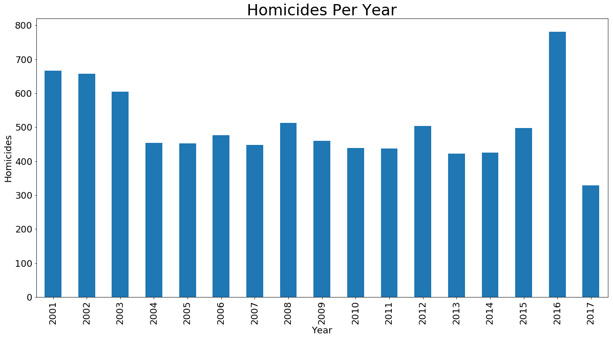
Homicides Per Year
Homicides per each year. 2017 is partial data.
ax = data[data['Primary Type'] == 'HOMICIDE'].groupby('Year').Year.count().plot.bar(figsize=(20,10), fontsize=18)
ax.set_xlabel('Year', fontsize=18)
ax.set_ylabel('Homicides', fontsize=18)
ax.set_title('Homicides Per Year', fontsize=30)
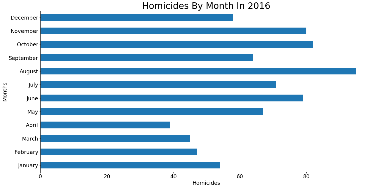
Homicides In 2016 By Month
w = data[(data['Primary Type'] == 'HOMICIDE') & (data['Year'] == 2016)]
ax = w.groupby('month').month.count().plot.barh(figsize=(20,10), fontsize=18)
ax.set_ylabel('Months', fontsize=18)
ax.set_xlabel('Homicides', fontsize=18)
months = ['January', 'February', 'March', 'April', 'May', 'June', 'July', 'August', 'September', 'October', 'November', 'December']
ax.set_yticklabels(months)
ax.set_title('Homicides By Month In 2016', fontsize=30)
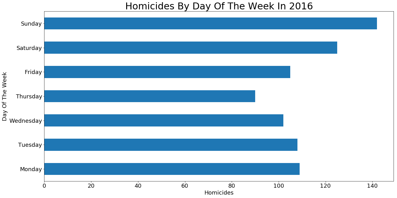
Homicides In 2016 By Day Of The Week
w = data[(data['Primary Type'] == 'HOMICIDE') & (data['Year'] == 2016)]
ax = w.groupby('weekday').weekday.count().plot.barh(figsize=(20,10), fontsize=18)
ax.set_ylabel('Day Of The Week', fontsize=18)
ax.set_xlabel('Homicides', fontsize=18)
ax.set_yticklabels(['Monday', 'Tuesday', 'Wednesday', 'Thursday', 'Friday', 'Saturday', 'Sunday'], fontsize=18)
ax.set_title('Homicides By Day Of The Week In 2016', fontsize=30)
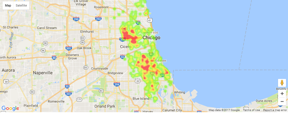
2016 Homicide Heatmap
import gmaps
import math

gmaps.configure(api_key="############################")

raw = data[(data['Primary Type'] == 'HOMICIDE') & (data['Year'] == 2016)]

locations = []
for index, row in raw.iterrows():
    lat = float(row['Latitude'])
    long = float(row['Longitude'])
    if not math.isnan(lat) and not math.isnan(long):
        locations.append((lat, long))

fig = gmaps.figure()
fig.add_layer(gmaps.heatmap_layer(locations))
fig
The Jupyter Notebook for this work can be found on GitHub